Create a New Microsoft 365 Subscription Chart

This guide provides a straightforward process for creating a new subscription chart in Microsoft 365, making it easy to visualize and manage your subscriptions. By following the steps outlined, users can efficiently organize their data, enhancing productivity and clarity. Whether you're a beginner or looking to streamline your workflow, this guide is a valuable resource for maximizing your Microsoft 365 experience.
1. Click "Microsoft 365"

2. Click "Subscriptions"

3. Click "Chart".

4. Click "Save"

5. Navigate to the folder you want to save the chart to.

6. Give the chart a new i.e. "M365 Subs"

7. Click "OK" to save.

8. Click the home icon.

9. Click "New" to create a new chart (Or you can edit an existing one)

10. Set the column layout of your dashboard.

11. Click the + button to add a new item to your dashboard

12. Click "Chart (Existing)"
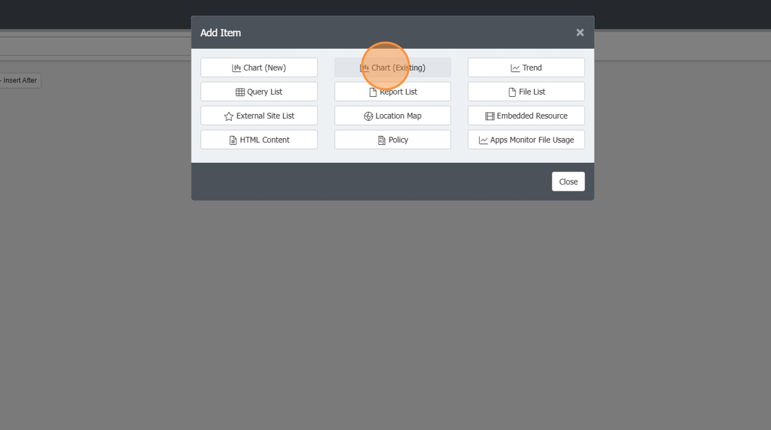
13. Double-click your "M365 Subs" saved chart

14. this will apply your M365 subs bar chart to your dashboard. You can then click Save.

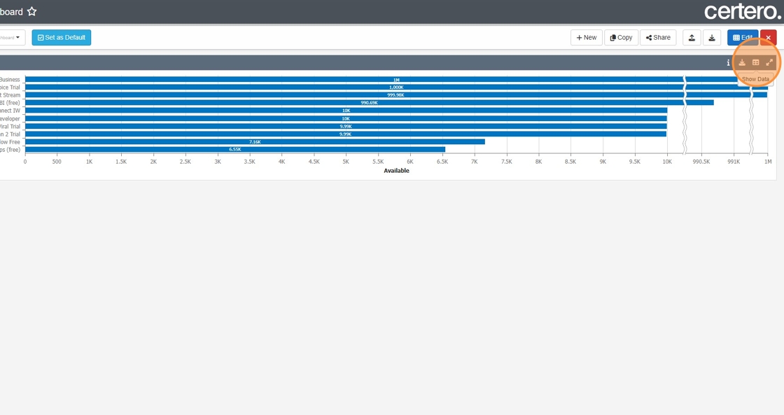
15. You can then click the "Show Data" icon to see the raw data for this chart.